Watch Pandemic Spread on New UMD Maps
Geography Researchers Show Disease Progression Over Space, Time
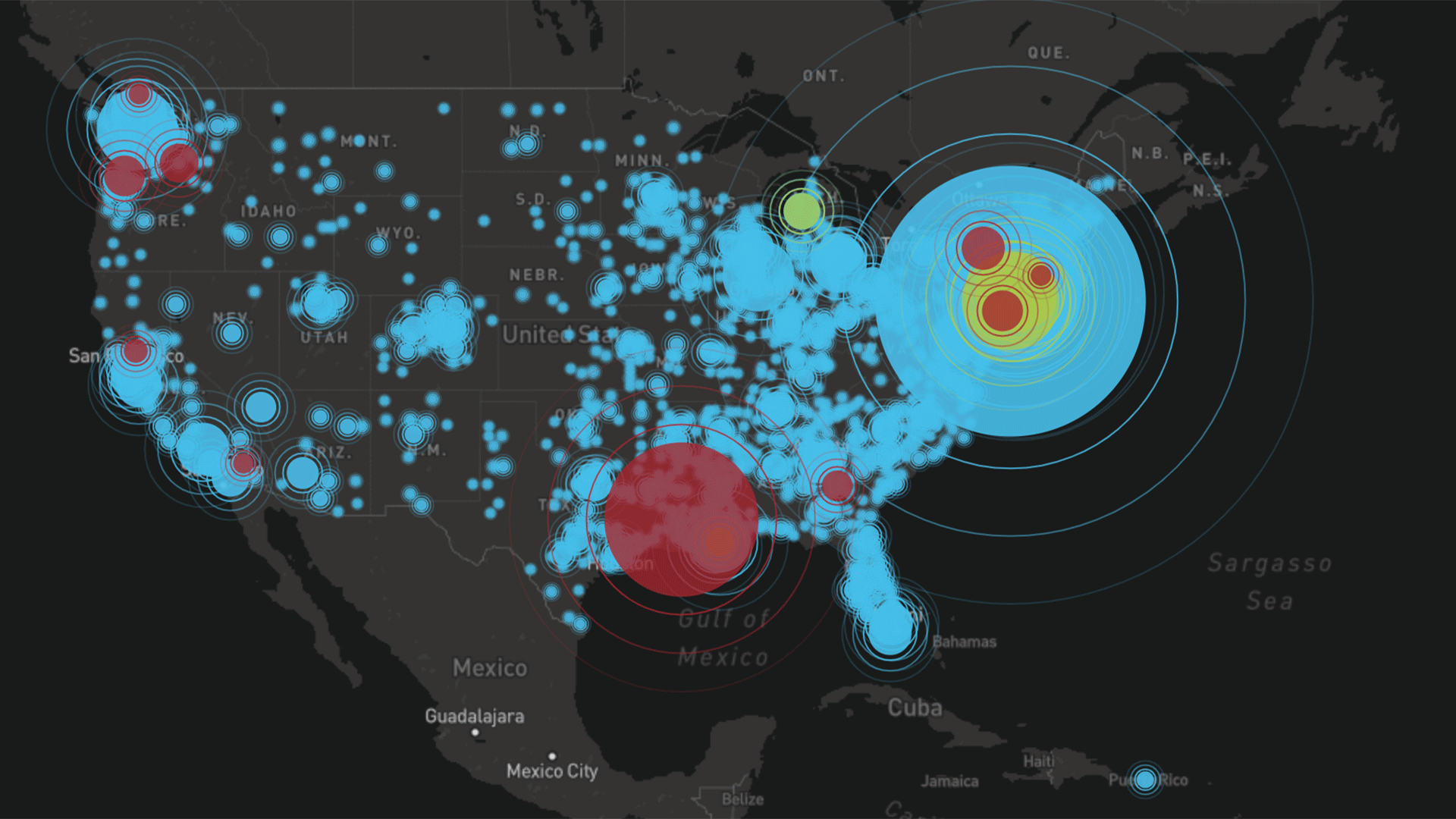
Map by the Center for Geospatial Information Sciences
New maps by UMD researchers show county-by-county COVID-19 infection data for each day since the outbreak began in the U.S.
While raw numbers of COVID-19 cases provide a sobering metric, new maps from University of Maryland geographers provide what may be the most detailed view yet available of the virus creeping nationwide, and then exploding into a pandemic.
Researchers in the Center for Geospatial Information Sciences (CGIS) present case data at the county level, tracking it day by day since late January, when the first positive case of the novel coronavirus was diagnosed in Washington State. One animated map shows how, throughout February, small clusters of cases begin to appear, mainly on the West Coast.
Like a spreading rash, circles denoting cases begin to proliferate around the country by early March as testing expanded. The symbols multiply alarmingly—and grow rapidly in size to indicate more cases—approaching the current day.
“The overall goal was to create a kind of free tool to give a more intuitive picture of the disease to people who want to monitor the data—maybe federal officials deciding how to distribute resources, or a state government that wants to see what’s happening in its region,” said Assistant Research Professor Junchuan Fan, who built the dramatic proportional symbol map.
A second map, constructed by CGIS graduate student Yao Li, uses the same data but factors in county populations to gauge rates of infection over time. Known as a choropleth, the map shows that high infection rates similar to those in New York exist in counties in Georgia, Arkansas, Colorado, Utah and Idaho, although they have received far less attention nationally.
The maps use data from a volunteer group, 1Point3Acres, that daily analyzes information released from states, as well as media reports.
Such maps allow researchers and others tools to begin recognizing geographic patterns in the disease spread, said Kathleen Stewart, CGIS director and geographic sciences professor.
“An individual anywhere in the country can look at what is happening in their county and track the number of cases over time, and also look at the adjacent counties, and counties adjacent to those counties, and begin to understand patterns with these cases over space and time,” she said.
Much more can be done with the maps showing geographic and temporal spread of the disease, Stewart said, from comparing them to social media data to see how discourse on COVID-19 changed as it spread, to studying the effects of mobility and travel on the virus’ progression—a question CGIS will soon be exploring, Stewart said.
Topics:
Tags:
Schools & Departments: